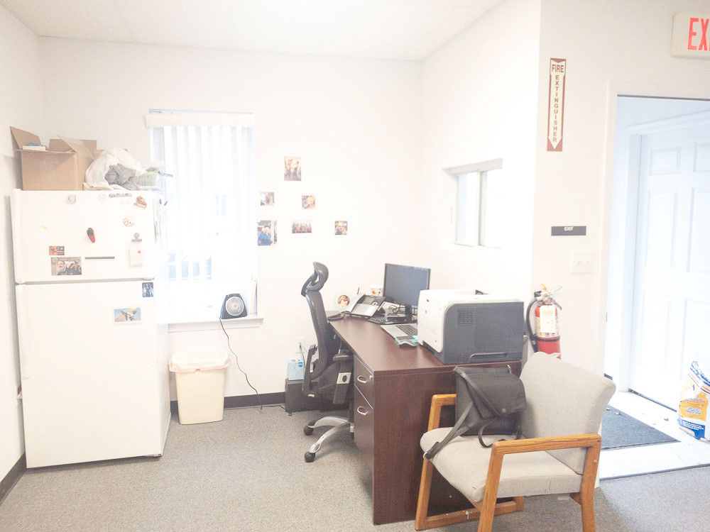
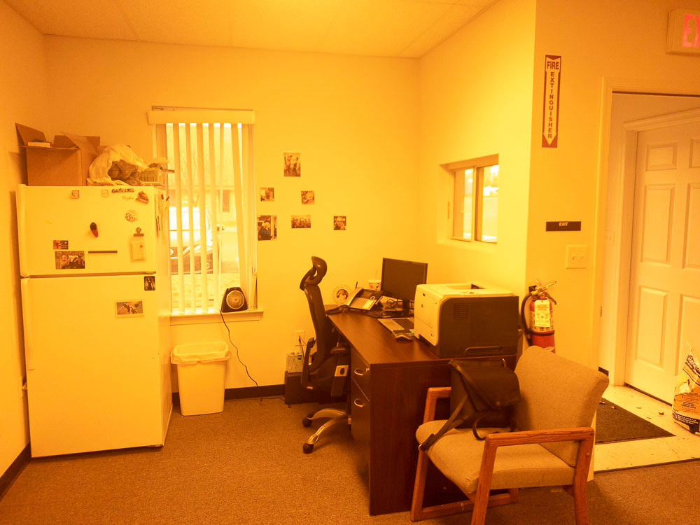
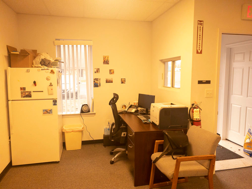
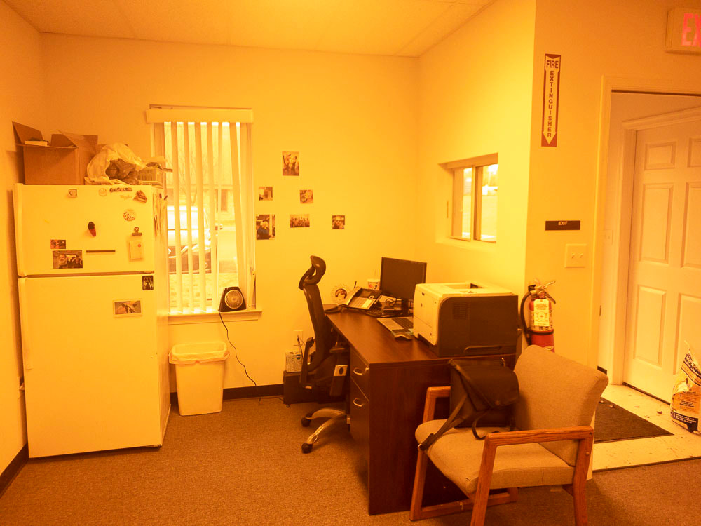
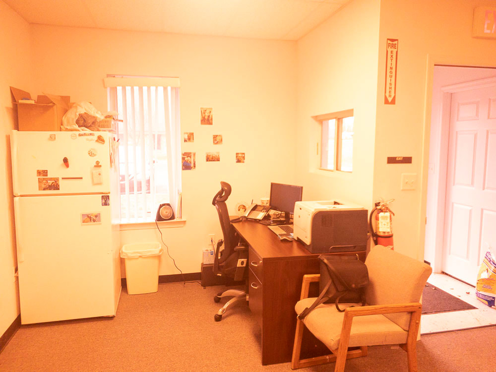
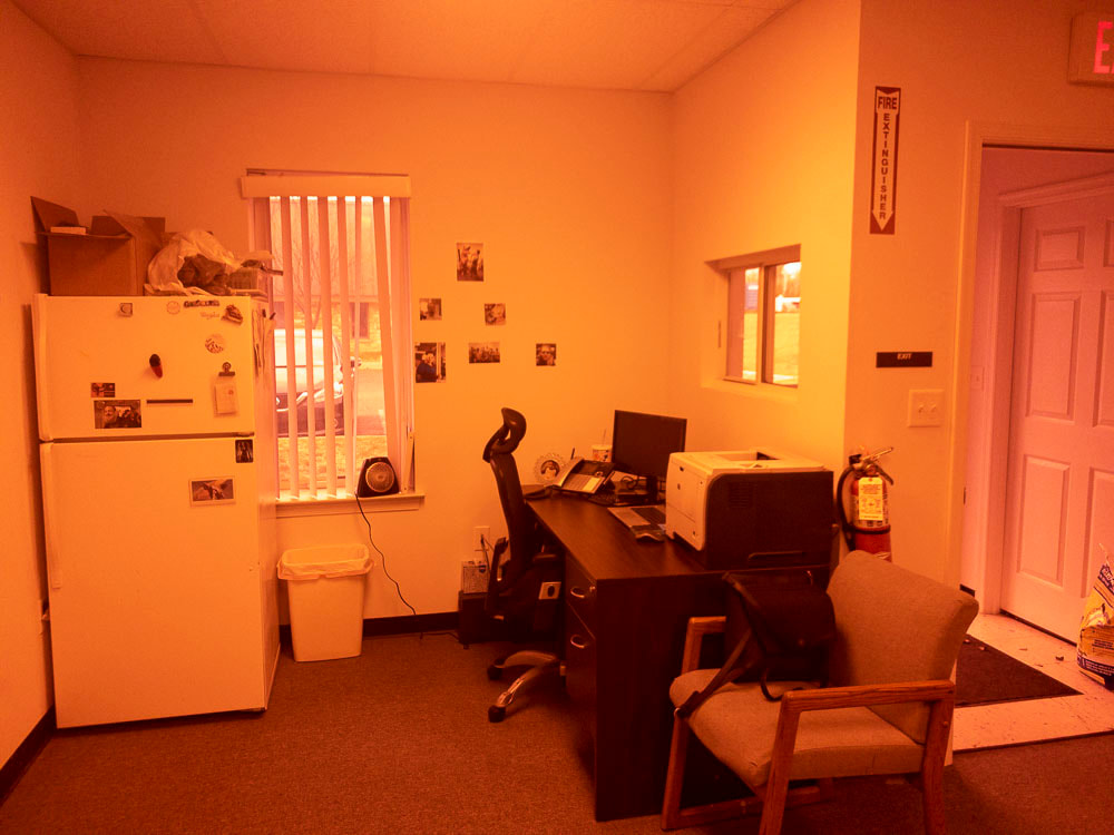
Low Vision Filters Comparison
Patients and doctors have found the following photographic approximation of each low vision tint color to be helpful in determining which shade to select. While we think this is super helpful, it’s not meant to replicate or replace the in-office tint-testing experience.
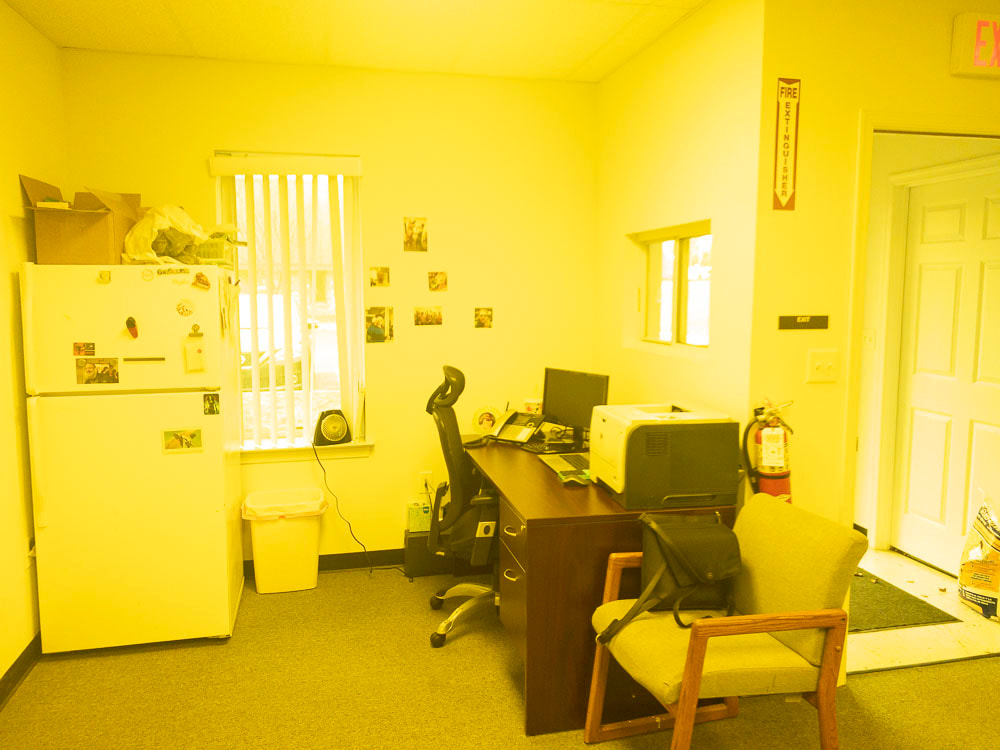
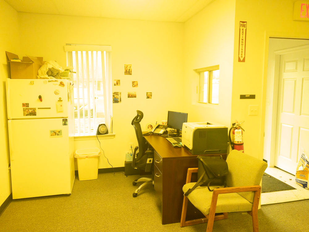
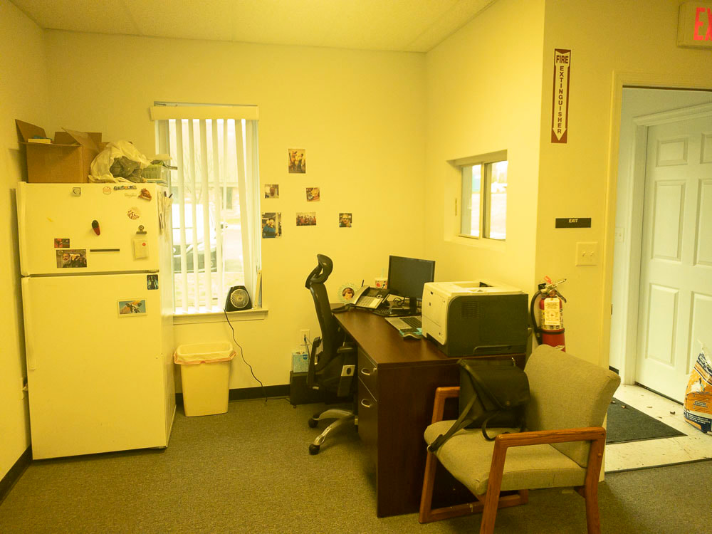
Check below for a side-by-side comparison of no filter vs the following low vision tints:

450

450X

450XG

511

511X

527

527X

550

550XD

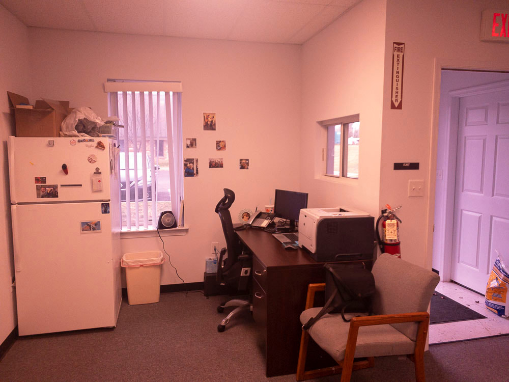
Corning Glarecutter

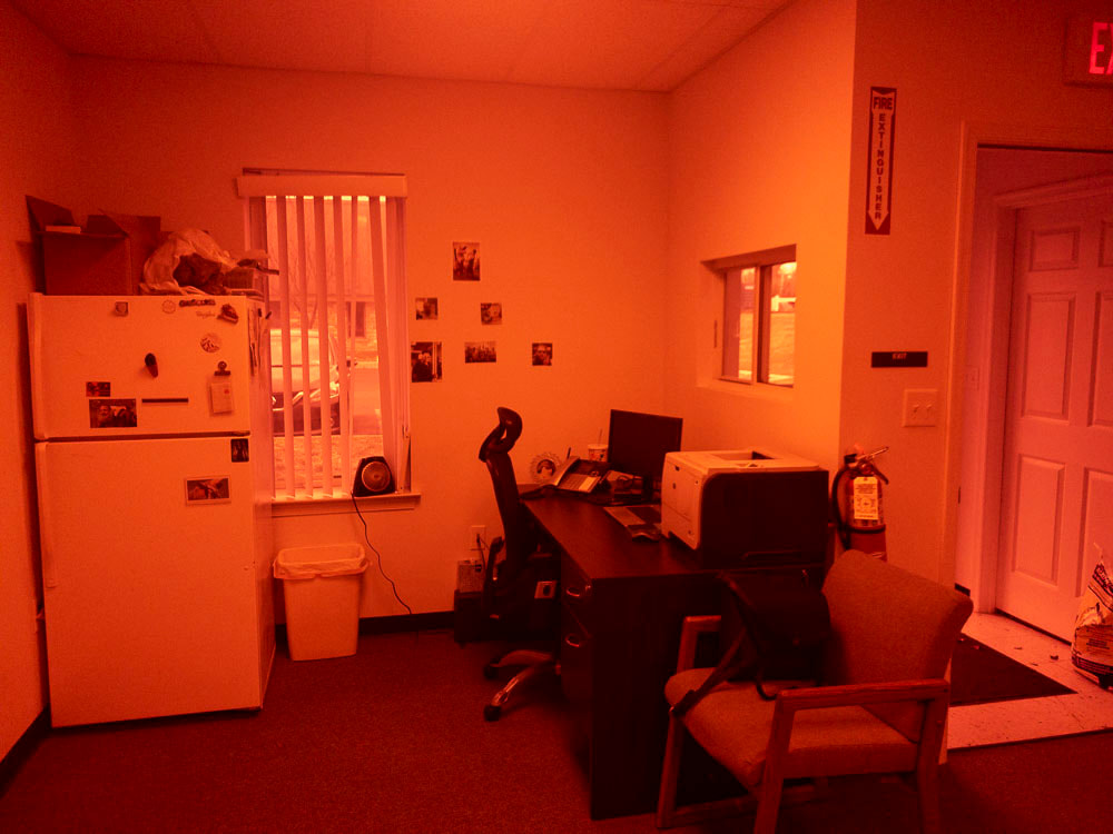
NoIR 81 (Dark Plum)

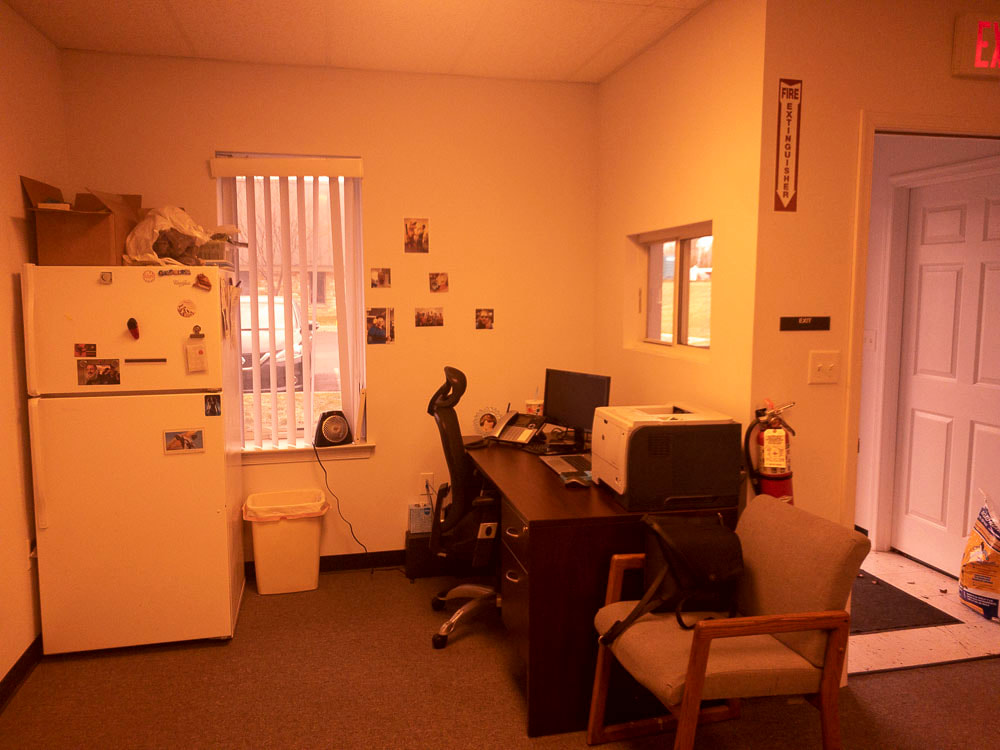
NoIR 88 (Light Plum)
Check below for a side-by-side comparison of no filter vs the following low vision tints: